
Calm cabins of the future
This is a special feature from PAX Tech's February 2021 Color Schemes, Lighting and Connectivity digital edition.
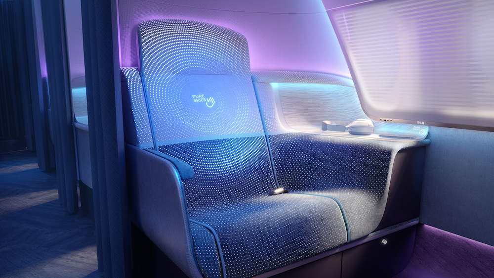
Seat fabrics on PriestmanGoode’s post-COVID interiors concept Pure Skies include photochromic and thermochromic inks that react to UV-C and heat cleaning to display a reassuring message that they are sanitized
Color, materials and finish (CMF) have always been hugely
important for aircraft interiors designers and suppliers when reflecting an
airline brand and soothing the passenger experience. Now, industry experts are
focusing on these details to build passenger trust and inspire a perception of
cleanliness in the cabin.
Something blue
While cabin design previously favored dark hues for the ability to hide stains and marks, PriestmanGoode is hearing more talk about the use of lighter colors, such as white, to create a sense of cleanliness. But, with light colors comes some challenges, like keeping the material clean and well maintained which is key for economic and environmental reasons, says Maria Kafel-Bentkowska, Head of Color, Material and Finish at PriestmanGoode.
“Whether this actually translates to the future of transport interiors is to be seen. It may be that we start seeing accents of light colors. The take up will also depend on how stain proof and self-cleaning material technologies develop,” she explains.
The company works with its customers to choose interiors schemes drawn predominantly from the airline brand colors, or in the case of national carriers, from the colors, patterns and visual heritage inspired by the region. White is traditionally seen as the symbol of cleanliness, purity and newness – especially in Western culture – but PriestmanGoode’s post-COVID interiors concept Pure Skies uses purples and blues to create a calm and reassuring onboard experience. Blue has strong links to medical environments and the UV Light cleaning methods that are popular in the industry right now. In the Pure Skies project, seating color is combined with thermochromic and photochromic pigments which react to heat from UV Light. When the cabin is cleaned, a message appears within the fabric of the seats, giving confidence to passengers that they are entering a newly sanitized environment, Kafel-Bentkowska says.
“CMF has always been a central element of our work. The challenge going forward will be to create color and material schemes that instill trust in passengers, reflect a sense of cleanliness while at the same time representing the airline’s brand,” she says.
Layered trust
Acumen Design Associates’ is working on a ‘blue sky’ conceptual program, focused on how specific colors, color temperature and saturation levels trigger different emotional responses in passengers and how this impacts productivity, relaxation and ability to rest inflight. It takes into account universally understood color theories and scientific and psychological studies based on neuro-aesthetics that influence the body’s circadian system (the human body’s internal clock).
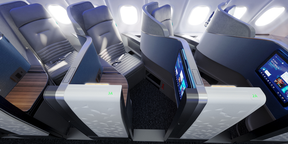
Acumen Design Associates’ work on the JetBlue Mint cabin refresh focused on how lighting, color and texture affect the passenger experience, including how subtle mood-lighting offers a sense of calm and serenity
The Biophilia Hypothesis describes the innate psychological connection all humans have with the natural environment, explains Lizzie Spreadbury, CMF Creative Lead at Acumen Design Associates. This is why humans tend to find colors that appear in nature to be the most relaxing. Blue is considered to enhance trust, safety and relaxation while green is commonly used in hospitality environments as it is considered to be a welcoming and reassuring color, she says, adding that these colors also trigger a physical response that lowers cortisol (the stress hormone) to make people feel more relaxed.
Working with light colors runs the risk of portraying a clinical and cold environment. “We should be careful about how and where it is used, although it would be a good choice for smaller touch points such as meal tray surfaces,” Spreadbury says. “We predict the next generation of cabin interiors will feature a range of welcoming and relaxing earthy tones, combined with tactile natural finishes.”

Lizzie Spreadbury, CMF Creative Lead, Acumen Design Associates
The quality and durability of materials are key considerations for future cabin designs. Self-healing and scratch resistant plastics remove any imperfection that indicate wear and tear, improving the passenger perception of cleanliness, Spreadbury explains.
Acumen Design Associates worked with JetBlue on the recent refresh of the Mint cabin. The design takes into account how light affects color schemes and inflight services, such as the presentation of food. Balanced brightness compliments and exposes a clean cabin. Subtle mood-lighting offers a sense of calm and serenity. The cabin also features easy-to-clean, durable, layered textures, such as the Polystone feature lighting, to emphasize the tactility of cabin touch points and create a sense of calm and relaxation.
“An easily maintained cabin and one that is easy to clean is now every bit as important as spectacular color scheme when it comes to delivering a consistent brand experience – reinforcing trust in air travel and building passenger confidence,” Spreadbury says.
New neutral
“Color plays a big part it thoughtful design. We consider it in all our projects and branding,” says Alexa Wordsworth, Marketing/Graphic Designer at Global Inflight Products (GIP). “Color is a way to convey emotions. We have hope looking forward and colors can help emphasize that.”
The company predicts that neutrals will gain popularity. More intense colors (such as red which is associated with caution) will likely be replaced with more comforting colors, such as blue and beige. “Neutrals are a safe option that can be incorporated without completely changing an airline’s color brand identity,” Wordsworth explains.
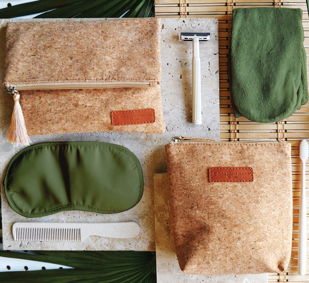
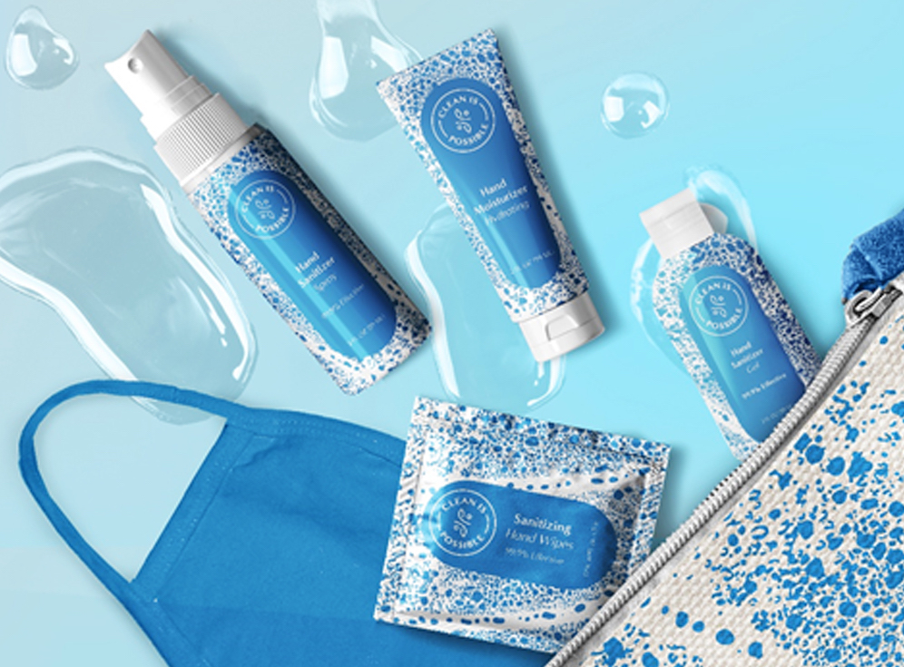
Global Inflight Products predicts earthy colors, such as the ones used in the Green Is Possible product line, and blue hues, as seen in the Clean Is Possible product line, will gain popularity as the industry moves through the pandemic
The onboard products supplier used blue in its branding before the pandemic, and carried the color into its personal protective equipment, galley and lavatory cleaning products line Clean Is Possible, along with beige, green and other earthy tones. “[Blue] is such a fitting color to represent purity, sanitization and security. Beige represents a comforting, cozy feeling,” Wordsworth tells PAX. “There have been many studies on how colors subconsciously make people feel. That information should definitely be considered when designing a cabin that will make passengers comfortable.”
“Green and earthy tones are also prominent in our Green Is Possible line – offering sustainable versions of key inflight products,” says Lisa Benzaoui, Chief Executive Officer at GIP. While sustainability-minded cabin products, such as bamboo fiber towels and sugarcane beverage napkins, was a relatively new concept in 2010, she says GIP predicts this trend will continue to grow in popularity for its natural and clean appearance. GIP is updating its offerings in all product lines. “Onboard products are focused on the necessities during this time and we always look ahead to refresh these basics for our clients - as we forecast a bright future for air travel,” Benzaoui says.
The Clean Is Possible line by Global Inflight Products
Clean scheme
Jamco has also seen a move toward the trend of white and blue as the pandemic brings the focus of hygiene and cleanliness to the forefront, as well as bringing outdoorsy colors in to brighten the cabin. The Venture Pristine Business Class seat, launched in January, was designed to emphasize cleanliness. It incorporates the latest antimicrobial and antiviral material solutions, and the trim and finish help maximize cleanliness both inflight and when sanitizing after use.
The company attends exhibitions, such as the annual Italian furnishing and accessories event Milano Salone, for inspiration on the latest trends in furniture and consumer products, which is brought into design projects. In the future, the company would like to expand the range of designs and propose total cabin coordination using galley, lavatories and seats manufactured by Jamco.
