
Eurowings unveils refreshed brand identity
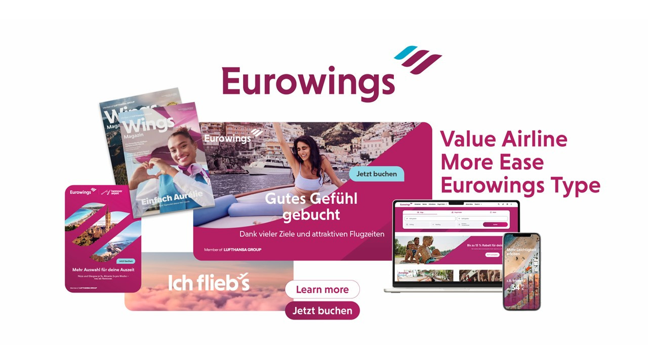
Eurowings’ new corporate design highlights its Wings logo mark
Eurowings has unveiled a refreshed corporate design, sharpening its brand presence as it continues to position itself as a European value airline.
The updated look is designed to reflect the airline’s brand essence, “More ease for everyone,” across its visual communication. Eurowings said the redesign will create greater clarity, recognizability and ease across all communication channels and throughout the passenger journey.
The redesign follows the airline’s evolution from a classic low-cost carrier to a value airline focused on attractive fares, comfort, flexibility and a more relaxed travel experience. The new corporate design is intended to make that shift visible across touchpoints, from booking to arrival.
“With the new corporate design, we are making our brand essence ‘More ease for everyone’ visually tangible. At the same time, we are creating a modern and consistent brand presence that sets us apart and further strengthens our recognizability,” said Dirk Otto, Head of Marketing at Eurowings.
At the center of the new identity is the airline’s Wings logo mark, which will take on a stronger role as an emotional design element. Eurowings said the Wings will appear more prominently in moving-image formats, campaign visuals and digital interfaces, evolving from a logo component into a defining brand symbol. The design represents flying, anticipation, freedom and ease, creating a consistent visual thread across channels.
Eurowings will also place greater emphasis on authentic imagery and an updated photographic style. Its distinctive Burgundy brand color will remain a key part of the identity, while gradients and transparency will add more movement and dynamism.
The simplified design system is intended to reduce complexity, especially across digital applications such as the airline’s website and app. Clearer navigation and more reduced design elements are expected to make orientation faster and easier for passengers. Inclusive design has also been integrated, with the aim of making digital platforms accessible to the widest possible user group.
The refreshed identity also includes Eurowings Type, a newly developed typeface designed for legibility across the airline’s applications. The Eurowings logo has also been revised and will appear in a clearer, more reduced form.
The new brand identity will roll out gradually across the airline’s touchpoints, including its website, airport environments and on board the aircraft.
